


Fluid responsive design
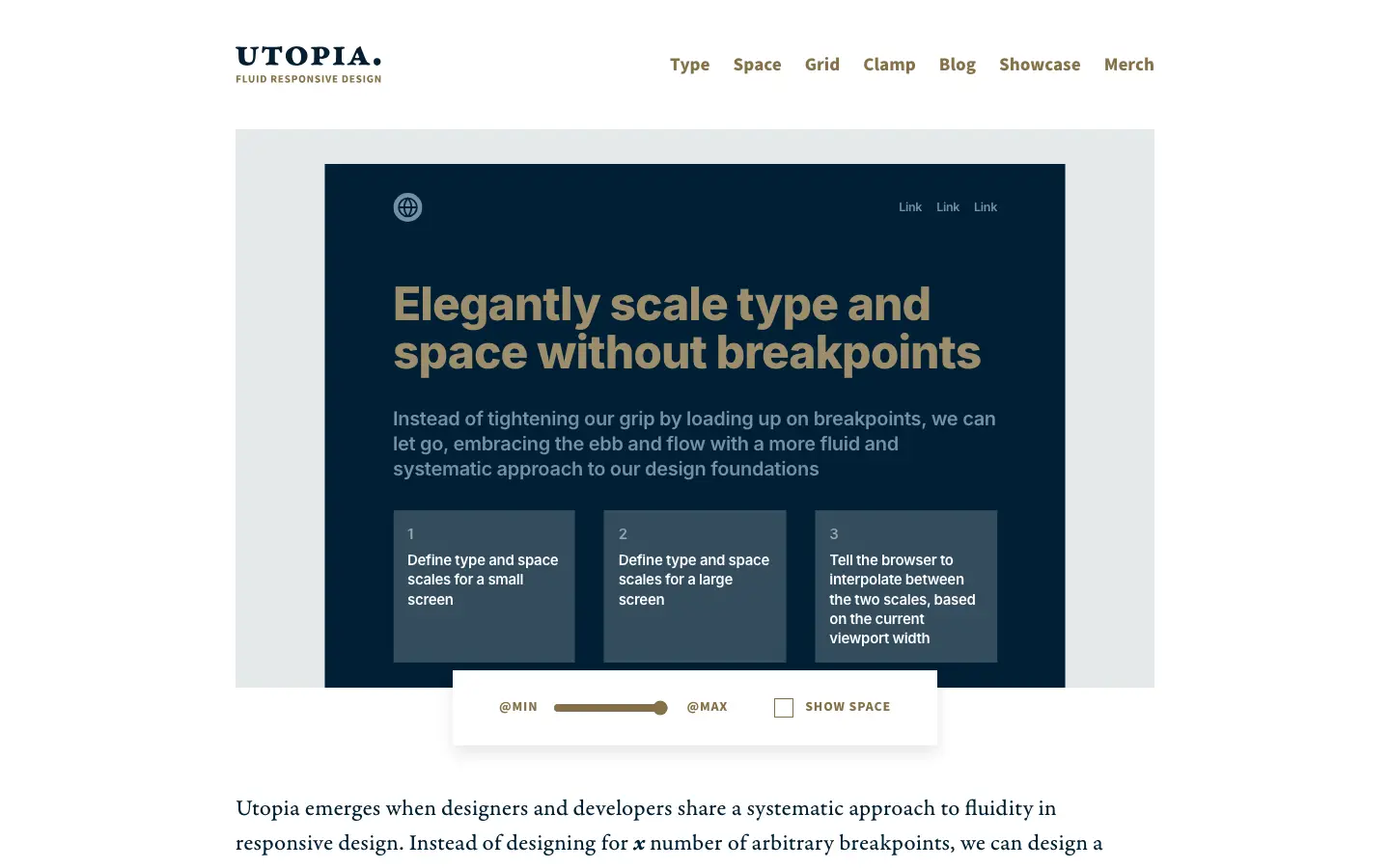
Utopia is a way of thinking about responsive layouts that scale fluidly, backed by free tools: you define type and space scales for a small screen and a large one, and the browser interpolates between them based on viewport width. Instead of piling up breakpoints, elements scale proportionally within one system, expressed as CSS clamp values, which keeps design and code aligned. Its calculators and articles suit designers and developers who want typography and spacing that flex smoothly.
- Type
- Tool
- Category
- Typography
- Added
- Sep 17, 2026